Email: info@mggpacking.com | Tel: +86-13510174848 ( Mr. Yao)


When you pick up a bottle of medication from your pharmacy, what do you notice first? The label, maybe—but before that, it's the bottle itself. Its shape, its texture, and yes, its color. In the world of pharmaceuticals, packaging isn't just about holding pills or liquids; it's a silent communicator. It tells patients, "This is safe. This is reliable. This is made with care." And when that packaging comes in a custom color, matched to exact specifications via Pantone standards, it does even more: it builds brand trust, reduces medication errors, and makes treatments feel personal. For pharmaceutical companies, partnering with a pharmaceutical packaging manufacturer that understands this balance of art and science isn't just an option—it's essential.
You might think color is a "nice-to-have" in pharmaceutical packaging, but it's actually a critical tool. Imagine a senior patient with multiple medications: a red bottle for blood pressure, a blue one for cholesterol, a green one for vitamins. Those colors aren't random—they're carefully chosen to help patients (and caregivers) differentiate between drugs at a glance, reducing the risk of mix-ups. For brands, color is identity. Think of the iconic orange bottles often used for prescription medications in some countries—that color instantly signals "pharmaceutical grade" to consumers.
But not all colors are created equal, especially in medical settings. The wrong shade could fade under UV light, making labels hard to read. A poorly mixed hue might bleed into the plastic, potentially interacting with the medication inside. And in a global market, consistency is key: a brand's signature blue pill bottle should look identical whether it's manufactured in Guangdong, shipped to Europe, or stocked in a U.S. pharmacy. That's where Pantone matching comes in.
If you've ever tried to match a paint color for your home, you know how tricky it can be—what looks "sky blue" on a screen might look "baby blue" in person. Now imagine that challenge, but with the stakes raised: the color must be consistent across thousands of bottles, batch after batch, and it must never compromise the safety of the medication inside. That's the world of Pantone matching for pharmaceutical packaging.
Pantone, the global authority on color standards, provides a universal language for color. Each shade has a unique code (think "Pantone 2945 C" for a specific blue), ensuring that a color selected in a design studio in New York will look exactly the same when produced in a dust-free GMP compliant workshop in China. For pharmaceutical manufacturers, this precision is non-negotiable. Here's why:
The process of achieving Pantone-perfect colors in medical-grade plastic is no small feat. It starts with selecting the right colorants—pigments or dyes that are FDA-approved and won't leach into the medication. Then, the manufacturer must test how the color interacts with the base plastic (often HDPE or PET) under different conditions: exposure to light, temperature changes, and long-term storage. Even the tiniest variation in the manufacturing process—like a slight change in temperature during molding—can shift the color. That's why leading manufacturers invest in advanced color-matching technology, including spectrophotometers and computerized mixing systems, to ensure every batch hits the exact Pantone code.
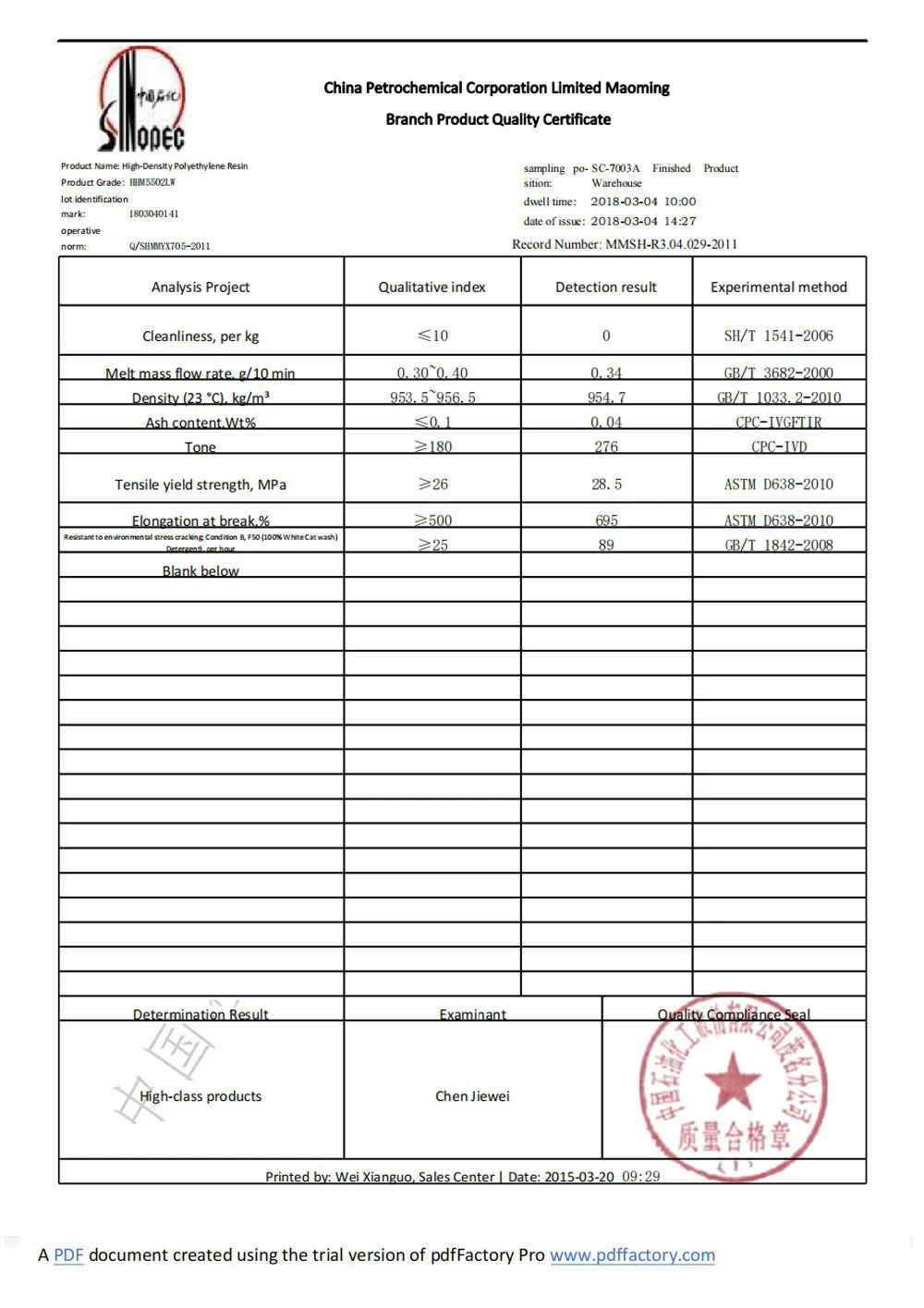
Color is only one piece of the puzzle. The plastic itself must meet the highest medical standards. For most pharmaceutical bottles—especially those holding pills, tablets, or dry powders—high-density polyethylene (HDPE) is the material of choice. Why? It's chemical-resistant, meaning it won't react with medications. It's durable, so bottles hold up during shipping and handling. And it's recyclable, aligning with the growing demand for sustainable packaging.
Take HDPE pill bottles with child-resistant caps , for example. These are workhorses of the pharmaceutical world, used for everything from over-the-counter pain relievers to prescription medications. The HDPE provides a protective barrier, keeping moisture and oxygen out to maintain drug potency. The child-resistant cap (CRC), a critical safety feature, is designed to be difficult for young children to open but manageable for adults—often requiring a "push and turn" motion. When combined with custom colors, these bottles become both safe and recognizable.
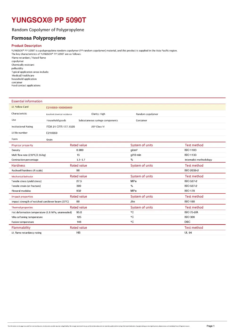
But HDPE isn't the only option. For liquid medications or more sensitive formulas, pharma-grade PET (polyethylene terephthalate) might be used, thanks to its clarity and barrier properties. Some specialized applications even use polypropylene (PP) for its heat resistance. Whatever the material, the key is that it's "medical grade"—tested to ensure it's free from harmful chemicals, won't degrade over time, and meets strict purity standards.
| Packaging Type | Common Material | Typical Capacity | Key Features | Color Customization Options | Compliance Standards |
|---|---|---|---|---|---|
| HDPE Pill Bottles | High-Density Polyethylene (HDPE) | 30ml–500ml | Child-resistant caps, tamper-evident seals, moisture barrier | Full Pantone matching, opaque or translucent | ISO 9001, FDA, GMP |
| Pharma-Grade Liquid Bottles | PET or HDPE | 60ml–1L | Precision dosing, leak-proof closures, UV protection (amber tint) | Clear, amber, or custom Pantone colors | ISO 9001, GMP, EU 10/2011 |
| Prescription Vials | HDPE or PP | 10ml–120ml | Tamper-evident neck bands, senior-friendly caps | Opaque colors for light-sensitive drugs, custom branding hues | FDA CFR 21, ISO 15378 |
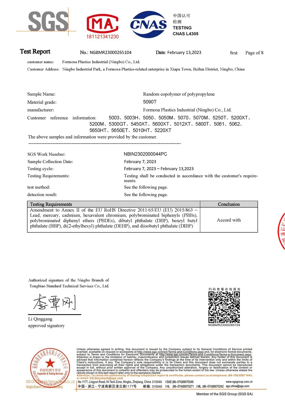
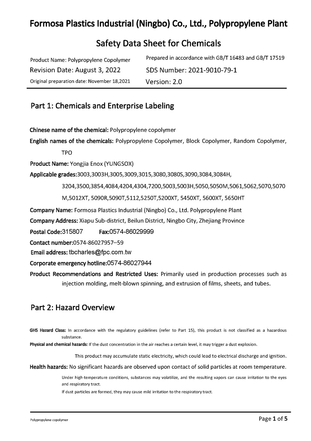
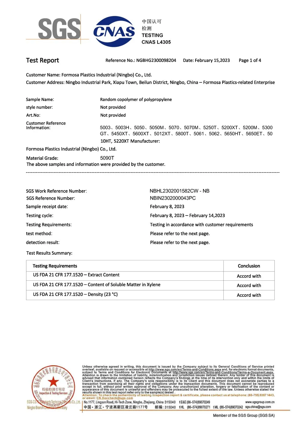
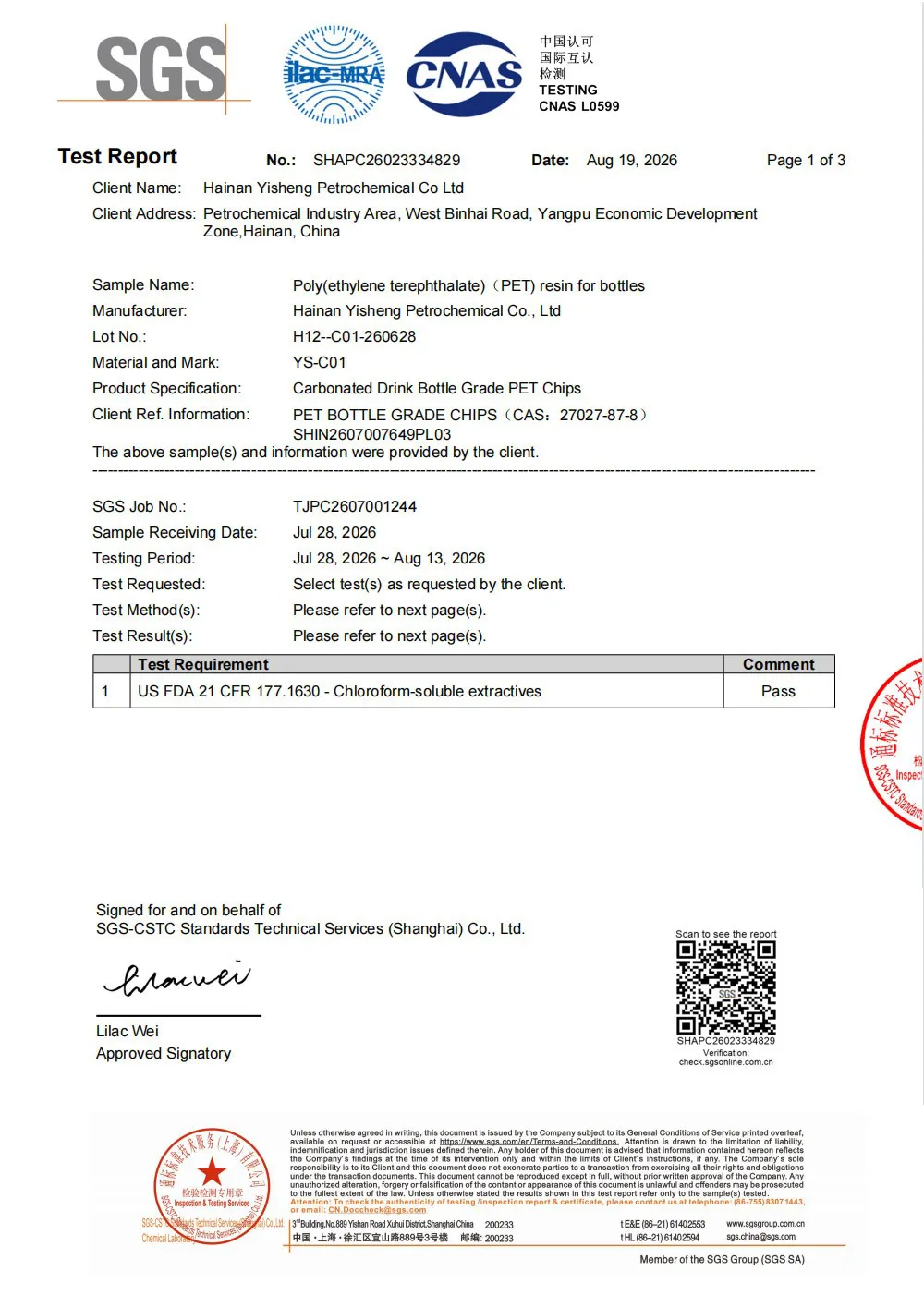
In pharmaceuticals, "close enough" isn't good enough. A single flaw in packaging could compromise a medication's safety, putting patients at risk. That's why leading manufacturers prioritize compliance with global standards like ISO 9001 and GMP (Good Manufacturing Practices).
An ISO 9001 certified packaging factory adheres to strict quality management principles, from design to delivery. This means every step—from raw material sourcing to final inspection—is documented, monitored, and continuously improved. For customers, ISO certification is a seal of approval: it shows the factory has the processes in place to consistently deliver high-quality products.
GMP compliance takes this a step further, focusing on the conditions in which packaging is made. A dust-free GMP compliant workshop is essential for pharmaceutical packaging. These controlled environments minimize the risk of contamination by airborne particles, ensuring that bottles and caps are produced in a sterile setting. Think HEPA filters, air pressure controls, and strict gowning protocols for workers. For products like pharma-grade plastic medicine bottles , which often hold medications that are ingested or applied topically, this level of cleanliness is non-negotiable.
But compliance isn't just about following rules—it's about building a culture of quality. At top factories, quality control starts with raw material testing (ensuring plastics meet medical-grade specs) and continues through every stage: color mixing, molding, cap assembly, and final packaging. Samples from each batch are tested for color consistency (using Pantone standards), strength, and seal integrity. Only when a batch passes all tests is it released for shipment.
Custom colors and high-quality materials are important, but for many pharmaceutical products, specialized features are just as critical. Take child-resistant caps (CRCs), for instance. According to the U.S. Consumer Product Safety Commission, CRCs have reduced child poisonings from prescription medications by over 80% since their introduction. When paired with custom-colored HDPE pill bottles, these caps add an extra layer of safety and brand recognition.
Designing a child-resistant cap that works with a custom-colored bottle requires careful engineering. The cap must fit securely, creating a tight seal to protect the medication. It must be compatible with the bottle's neck finish (the threading that connects the cap to the bottle). And it must undergo rigorous testing—including the "child resistance test," where young children are observed trying to open the cap, and the "adult usability test," to ensure seniors and people with limited dexterity can open it without difficulty.
Tamper-evident features are another must-have. These include breakable neck bands, foil seals under caps, or shrink sleeves that show visible damage if the bottle has been opened. For patients, these features provide peace of mind: "This bottle hasn't been tampered with since it left the factory." For brands, they reinforce trust and comply with regulatory requirements (e.g., the U.S. FDA's Tamper-Evident Packaging Rule).
Creating a custom-colored, medical-grade pill bottle isn't a one-step process—it's a journey that involves collaboration between the pharma brand and the packaging manufacturer. Here's a simplified look at how it works:
The pharmaceutical packaging industry is evolving, and custom color bottles are no exception. Two trends are shaping the future: sustainability and patient-centric design.
Sustainability is top of mind for brands and consumers alike. Manufacturers are exploring PCR (post-consumer recycled) plastics for medical-grade bottles, ensuring they meet the same purity and safety standards as virgin plastics. Custom colors can help here too—using natural colorants or reducing the amount of pigment needed, lowering the environmental footprint.
Patient-centric design is about making packaging easier and safer for end-users. For example, larger, easier-to-read labels paired with high-contrast custom colors can help visually impaired patients. "Senior-friendly" caps (easier to open than traditional CRCs) are being developed, without sacrificing child resistance. And smart packaging—like bottles with color-changing strips to indicate expiration—could soon become mainstream, with custom colors playing a role in these interactive features.
In the world of pharmaceuticals, every detail matters. From the medication inside to the bottle that holds it, quality and safety are non-negotiable. Custom color bottles, matched to exact Pantone standards, are more than just a design choice—they're a tool to build trust, enhance safety, and connect with patients. When produced by a pharmaceutical packaging manufacturer that prioritizes ISO 9001 certification, GMP compliance, and precision engineering, these bottles become a reflection of the care that goes into the medication itself.
So the next time you pick up a prescription bottle, take a moment to notice its color. Behind that hue is a story of precision, compliance, and a commitment to patient safety—one Pantone shade at a time.